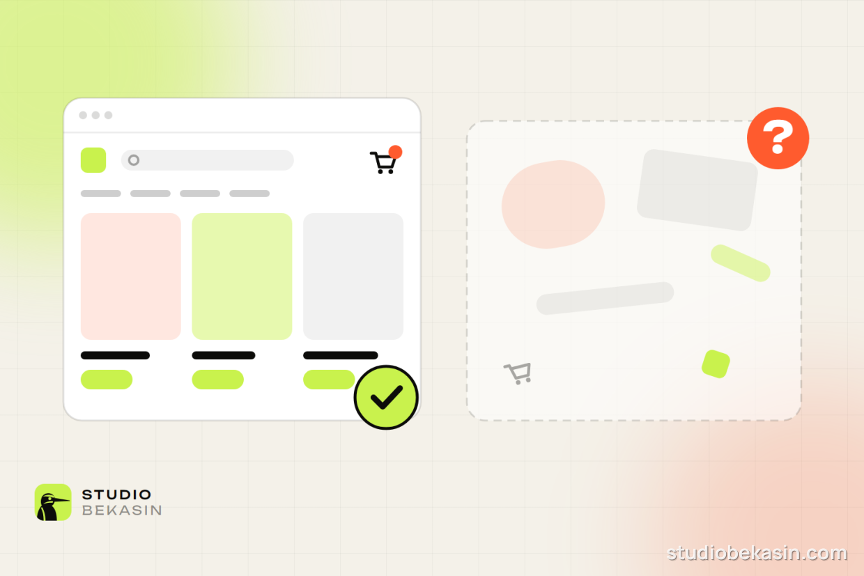
Most sites grow chaotically: a new service gets a new page, a new idea gets a new menu item. Two years later nobody, the owner included, knows where anything is. Good structure is planned before the design, not after it.
Start with questions, not the company
Write down your customers’ ten most common questions: how much does it cost, how long does it take, what exactly is included, how do I get in touch. Every important question needs a clear home on the site. We organise the menu around what people look for, not around how the company is organised internally.
Shallow, not deep
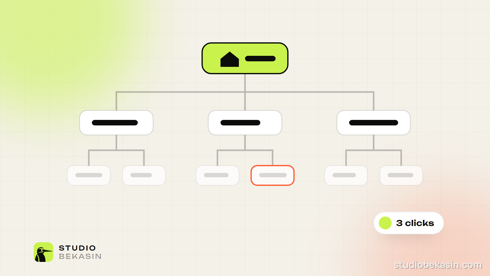
A good rule of thumb: every important page is at most three clicks from the homepage. The deeper a page is buried, the less often visitors and Google find it.
An example structure for a small business
- Home — who you are, who you work for and the main action.
- Services — an overview plus a separate page for each service.
- Work — examples with results, grouped by type.
- Pricing — even rough figures save a lot of questions.
- About — the people, experience and way of working.
- Blog — articles grouped by topic.
- Contact — form, phone, address and map.
The menu
- Five to seven main items. More is distracting.
- Familiar words: “Services”, not “What we do”; “Contact”, not “Let’s talk”.
- The main action — call, enquiry, cart — always visible, on phones too.
URLs
The address is part of the structure. /services/online-stores/ tells you exactly where you are. Keep it short, readable and in Latin characters: non-Latin URLs often turn into long %D0%BE%D0%BD… strings when shared in a chat.
Links between pages
Internal links show Google which pages matter most and how topics connect. We use a “hub page + related articles” model: the service page links to articles on its topic, and every article links back to the service. Breadcrumbs (Home › Blog › SEO) help visitors find their way and help Google understand the hierarchy.
One page, one goal
When two pages answer the same question, they compete with each other and Google does not know which to show. Merge them into one stronger page and 301-redirect the old one.
Good structure goes unnoticed. You only notice it when it is missing.
Before every new site we map out the pages and test the map with real people. If your site has grown chaotically, we can put it in order.