Open the analytics of almost any business website and the picture is the same: most visitors arrive on a phone. Yet many sites are still designed on a large monitor and then “squeezed” down for mobile. The result is familiar — tiny text, buttons that are hard to tap and menus that only half open.
What mobile first means
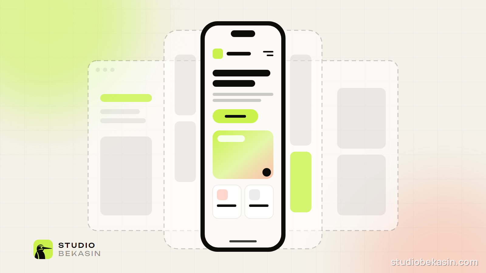
Mobile first is an approach where we design for the smallest screen first and only then add the layout for tablet and desktop. We start from the constraint, not from the luxury of empty space.
- Content comes first. At 375 pixels there is no room for clutter, so we decide clearly what matters most.
- Built for thumbs. Buttons and links are large enough and far enough apart to tap comfortably.
- Fast loading. We start with less code and fewer images; larger screens get the extras only when they need them.
How we work
- We order the content and key actions for the phone.
- We design at 375 px and test on real devices.
- We expand the layout for 768 px (tablet) and 1440 px (desktop).
- We check speed and accessibility at every size.
A site that works well on a phone almost always works well on a big screen. The reverse is rarely true.
Why it matters for SEO too
Google indexes websites by their mobile version. If the mobile experience is slow or awkward, your rankings suffer — no matter how good the site looks on a desktop.
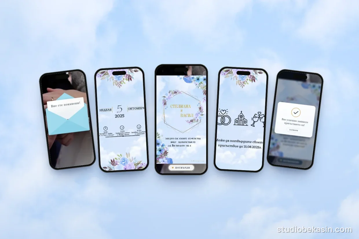
We take the same approach with smaller projects too. Guests almost always open online wedding invitations on their phones, so we design them for the small screen first.
Not sure how your site performs on a phone? Get in touch and we will send you a short review with concrete recommendations.