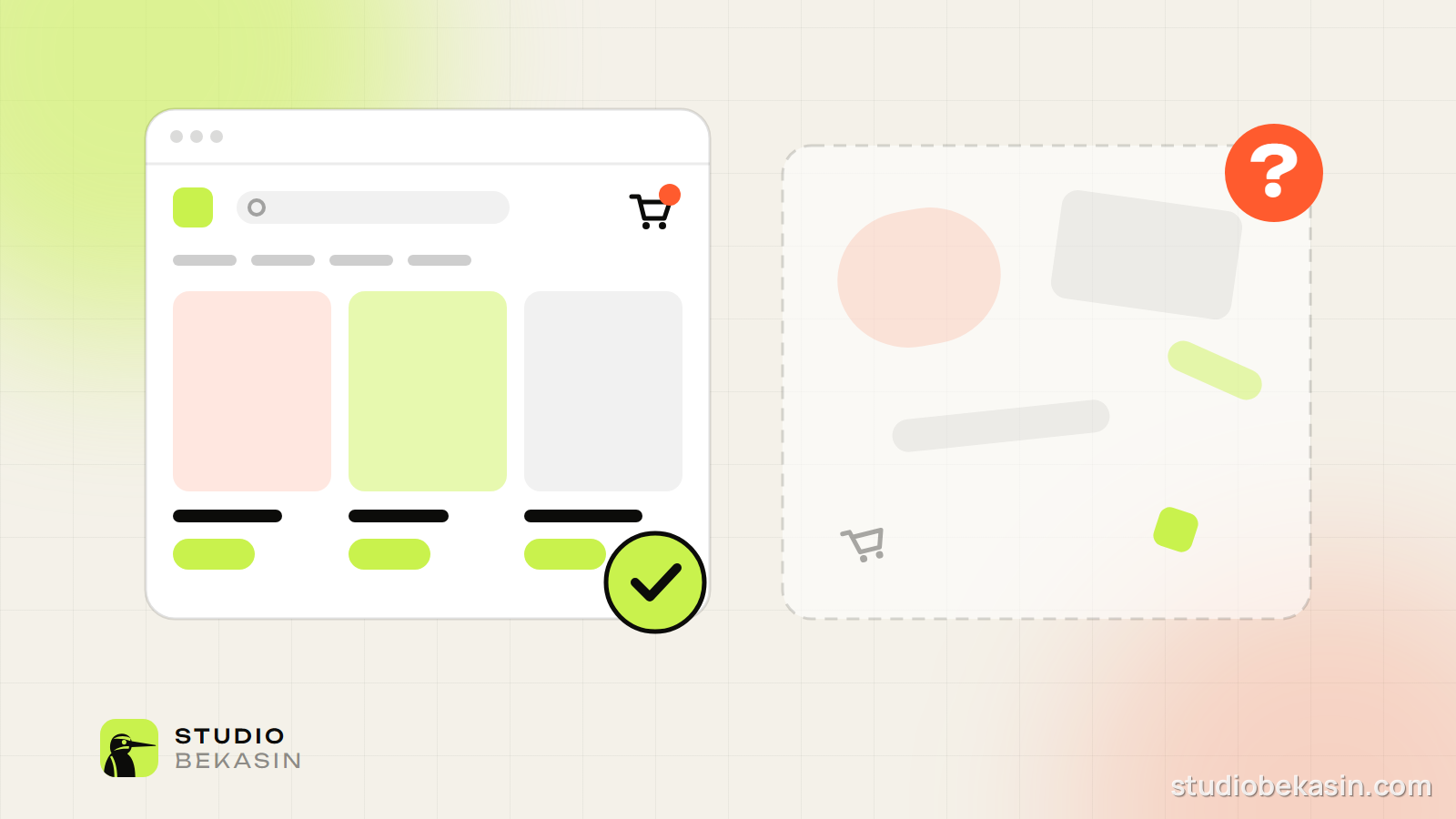
Every owner wants a store that looks like no other. Fair enough — you want to stand out. But in e-commerce there is a difference between looking different and working differently. The first sells. The second often gets in the way.
Jakob’s Law
Usability expert Jakob Nielsen put it simply: users spend most of their time on other sites. They arrive with habits formed on Amazon and the dozens of stores they already shop at, and expect yours to work the same way.
What shoppers expect to find
- The logo top left, linking to the homepage.
- Search at the top, visible rather than hidden behind an icon.
- The cart top right, showing how many items are in it.
- Categories in the main menu, with plain names.
- On the product page: images on the left; title, price, size or variant and a big “Add to cart” button right next to the price on the right. On phones — the same, stacked.
- Delivery, returns and contact details in the footer.
The cost of surprise
Every unusual element makes visitors stop and think: where is the menu, is this a button, how do I go back. A few seconds of hesitation sounds minor, but in a store it adds up on every product and every step towards checkout.
According to Baymard Institute research, around 70% of online shopping carts are abandoned. Among the most common reasons are unexpected costs, forced account creation and a long or confusing checkout. An unconventional interface adds one more. We catch the rest with our pre-launch checklist for online stores.
Common traps
- A menu hidden behind an unlabelled icon, even on desktop.
- Icons without text whose meaning has to be guessed.
- Horizontal scrolling or scroll-jacking for effect.
- A Buy button that does not look like a button.
- Custom cursors, intro animations before the content, pages slowed down by effects.
Where to be unique
- Visual identity: colours, typefaces, illustration.
- Photography: your own, consistent, showing the product in real use.
- Copy: your tone of voice, product stories, honest descriptions.
- Service: fast replies, easy returns, packaging people remember.
- Details: small animations that confirm an action instead of delaying it.
Be different in how you look, not in how you are used.
A quick test
Hand your phone to five people who do not know the store and ask them to find a product and get to payment. Do not help. Wherever they hesitate, you are losing orders. Five people are usually enough to uncover the biggest problems.
We build stores that look like your brand and work like the stores your customers already know. Get in touch if you would like us to review yours.